Tracing Picasso is a project that aims to analyse and understand the Picasso Phenomenon.
Picasso’s artworks are present throughout the greatest art collections and museums today. We want to retrace the path of these artworks (provenance) as well as their institutional reception, both in Europe and the US, in order to get a better understanding of this global phenomenon. Here are a few of our research questions:
- When were Picasso’s works acquired by the various institutions?
- Are there peaks or patterns that can be identified?
- Which works sparked interested at which times?
- Through which routes did they spread from their place of creation until their current collection?
The data set from American museums is very rich and we have therefore decided to produce several types of visualisations to explore it. Data from European museums (specially in Spain and France) is not as easily accesible, and reusable. The amount of labor required to retrieve the data (from European museums), together with copyright issues, had a major impact in the results we are presenting today.
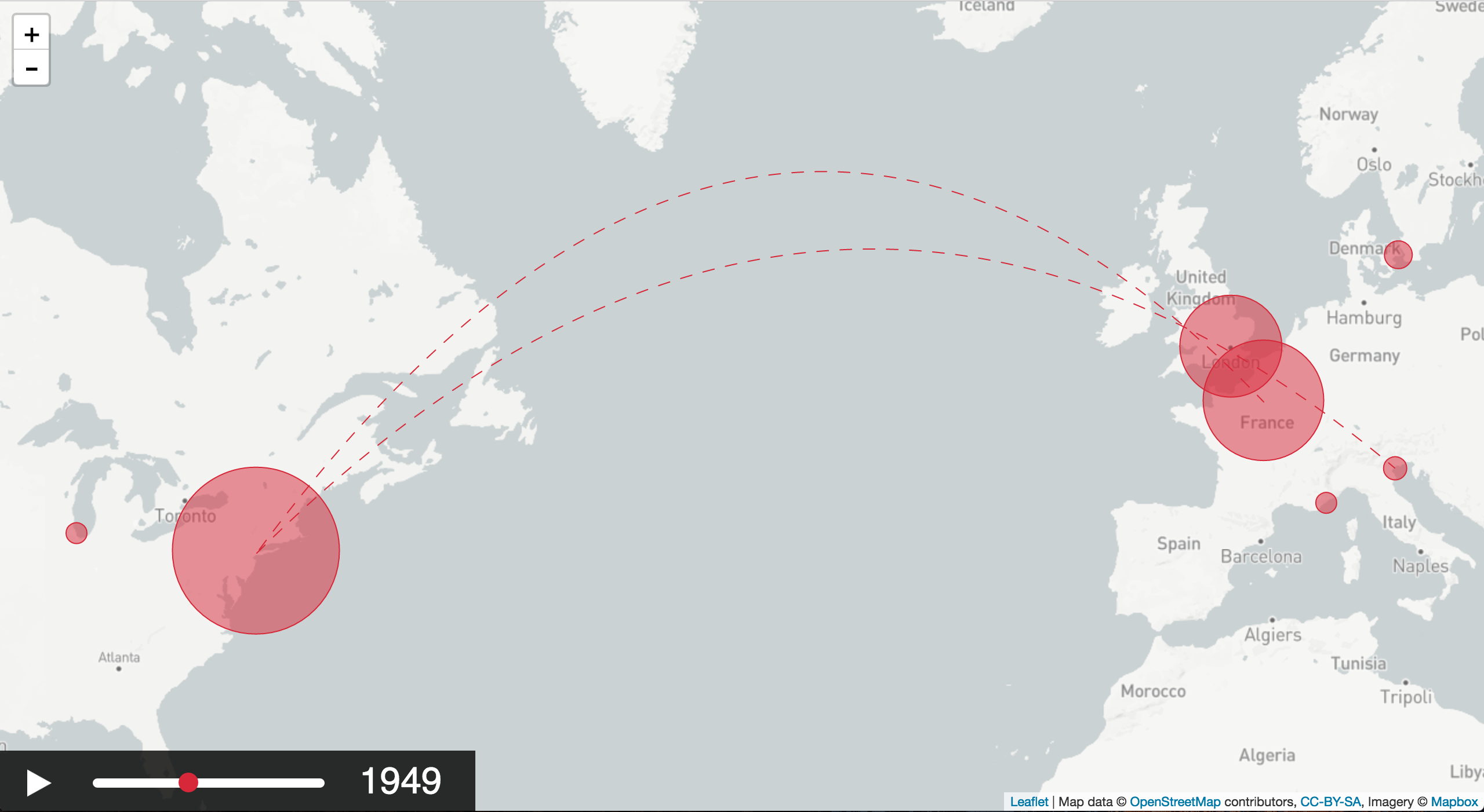
The time-map
This interactive visualisation aims to show the migrations of Picasso’s artworks throughout the world. The spatial dimension highlights not only his personal travels (where the artworks are created) but also the one of his artworks (where they were and currently are). The chronological dimension allows for each work to travel from one location to the next. It also shows the growing size of the various collections as the artworks are acquired by the institutions.
Demo (tested with Chrome): https://ilokhov.github.io/picasso
Code: https://github.com/ilokhov/picasso
Basic features and functionalities for the map/time visualisation:
- displaying the location of the objects
- temporal dimension: showing location at a certain time
- visualise the movement of the objects
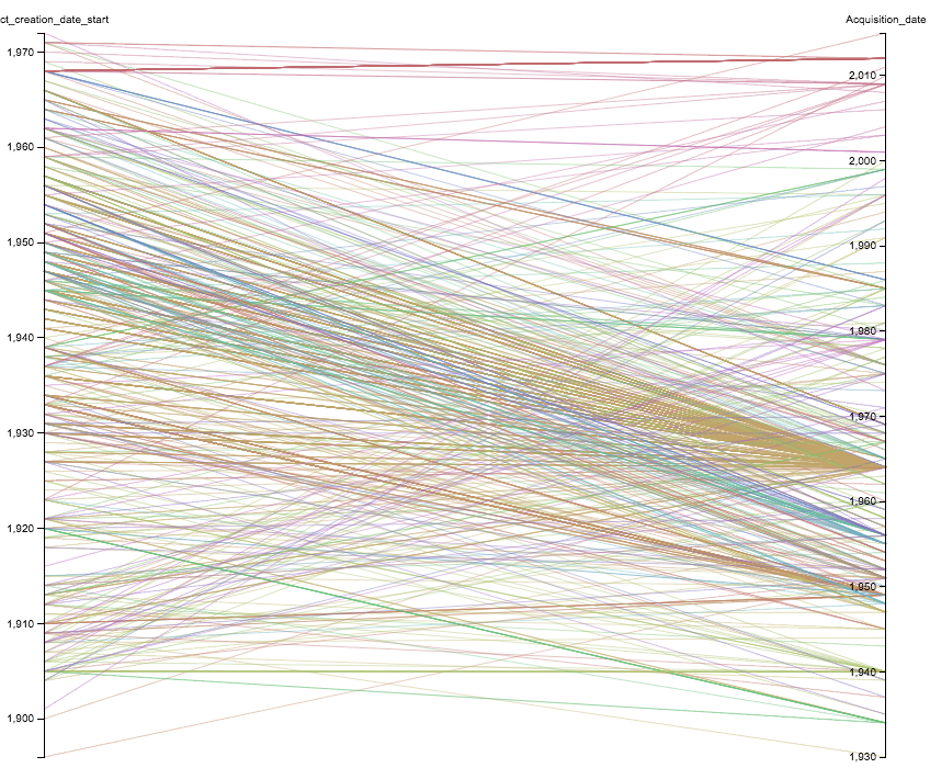
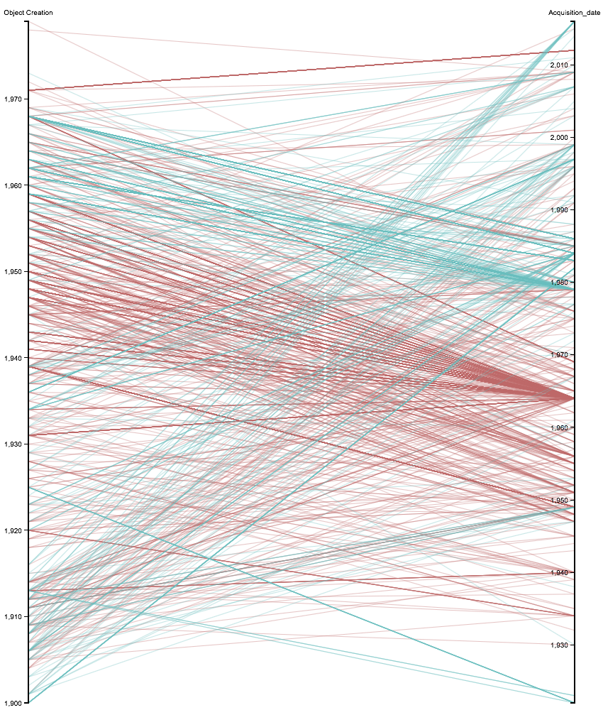
The graphs
These visual representations of our data set enable more detailed information on the acquisition trends. The graphs reveal certain clusters and peaks that require further analysis, prompting reflexion and creating need to supplement our data.
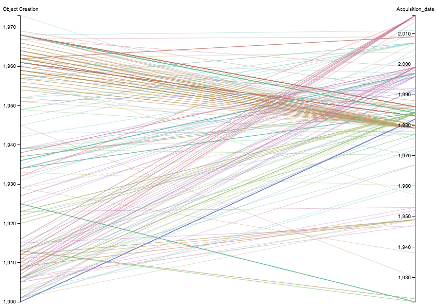
A few preliminary results:
- A general observation in the data: there are many more gifts than purchases in the direct provenance of the works.
- These donations contain certain periods of Picasso’s production that interestingly complete the museum’s collection.
The data
We have currently normalised and merged data from UK and US open access collections:
- MoMA (https://github.com/MuseumofModernArt/exhibitions)
- Met (https://github.com/metmuseum/openaccess)
- Getty Provenance Index (http://www.getty.edu/research/tools/provenance/search.html)
- Carnegie Museum (US) (https://github.com/cmoa/collection)
- Tate (UK) (https://github.com/tategallery/collection)
To use data, we required several attributes, such as the creation date, the acquisition date and the current collection. We would like and have begun to complete the provenance (all locations and dates for each individual artwork).
Data processing and clean up
- OpenRefine (http://openrefine.org/)
- Excel
- Access to the cleaned up data will be provided on github
- Data Structure and interchange format for further use in visualisation: JSON
Data structure
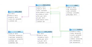
Our project might be extended, so that bigger dataset could be used. In that case we put the extended data on a server in a relational DBMS (here open source MariaDB). Then by means of SQL, all queries like “what artworks were produced after two particular artist met”, or “where were centers of art dealers activity after WW2” can be answered. The query result, which is originaly in a table format is transformed then to JSON structure in PHP and passed to the visualizsation tool. Here there is the relational schema we propose:
Tools for visualisation we evaluated:
- Leaflet, JavaScript library for interactive maps (http://leafletjs.com/)
- Various JavaScript libraries providing time sliders (for example https://github.com/socib/Leaflet.TimeDimension)
- JavaScript Maps (https://www.amcharts.com/javascript-maps/)
- RAW for visualisation of separate collections (http://rawgraphs.io/)
- Palladio, tool for visualisation of historical data (http://hdlab.stanford.edu/palladio/) (upload spreadsheet / .csv; various options for map display and filtering by time)
We concldued there is no “out of the box” solution for time/map viz that we found.
- problems we had with some libraries and tools:
- not versatile and generic enough
- too complicated or not well documented enough for easy reuse
- do not offer sufficient functionalities and have to be extended
In our case, it was easier to implement the functionality by oneself.
Implementation geotemporal visualisation:
- OpenStreetMap for map data (http://www.openstreetmap.org/)
- Mapbox for styling the map (https://www.mapbox.com/)
- Using map library leaflet (http://leafletjs.com/)
- Leaflet plugin for creating curves (used for flow arcs) (https://github.com/elfalem/Leaflet.curve)
Issues encountered:
- Data
- Copyright and licensing issues
- Most data creators, aggregators and projects don’t share data
- Most databases don’t offer complete data dumps
- Not all online data is available at the open data repositories
- eg Tate shows all works online, but the open dataset on github does not include loans -> mismatch
- eg Met shows provenance on their website, but didn’t include the information in the open dataset
- Republishing of merged dataset is problematic, as not all data sources share the same license
- Most open data is not documented properly – call for paradata
- Most datasets contain complex fields, which summarize lots of information
- call for reconciliation
- Location of owner ≠ location of artwork, so we simplified it.
- Tools
- SPARQL endpoints:
- SPARQL offers lots of flexibility, but requires extensive knowledge of the underlying data model
- Many different data models exist, so queries can’t be reused
- Wikidata – Wikibase model
- Europeana – EDM
- British Museum – CIDOC-CRM
- endpoints are not stable
- OpenRefine extensions:
- Manual installations necessary
- No standard reconciliation services are pre-configured
- JS libraries
- Many libraries out there – difficult to check which one could be used to implement the desired result (takes some time to evaluate them)
- Data structure
- Coming up with a good data structure is tricky
- Data import
- Problems fitting data from spreadsheets into required JSON format
- SPARQL endpoints:
Participants
- Anna Neovesky @annavsk (https://twitter.com/annavsk)
- Florian Wiencek @austrianflow (https://twitter.com/austrianflow, http://www.florianwiencek.com, http://www.musealisten.berlin)
- Ivan Lokhov @ilokov (https://twitter.com/ilokhov, http://ivanlokhov.com/)
- Nuria Rodríguez Ortega @airun72 (https://twitter.com/airun72)
- Sonja Gasser @Sonja_Gasser (https://twitter.com/Sonja_Gasser, http://archivesonthemove.org/)
- Leo Zorc @leozorc (https://twitter.com/leozorc, https://www.gta.arch.ethz.ch/personen/leo-zorc/curriculum)
- Lena Krause (lena.krause@umontreal.ca)
- Nicola Carboni @wlpbloyd (https://twitter.com/wlpbloyd)
- Joanna Gancarczyk (jgan@ath.bielsko.pl, https://www.researchgate.net/profile/Joanna_Gancarczyk)
- Maribel Hidalgo Urbaneja @MaribelHU (https://twitter.com/MaribelHU, http://m-hidalgo.com)
Comments
One response to “Tracing Picasso”
Watch their presentation at https://youtu.be/xw4GOhdHTrU?t=8200