Category: Report

  • Looking back on Coding Dürer—and envisioning future perspectives

    Looking back on Coding Dürer—and envisioning future perspectives

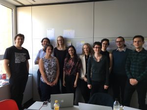
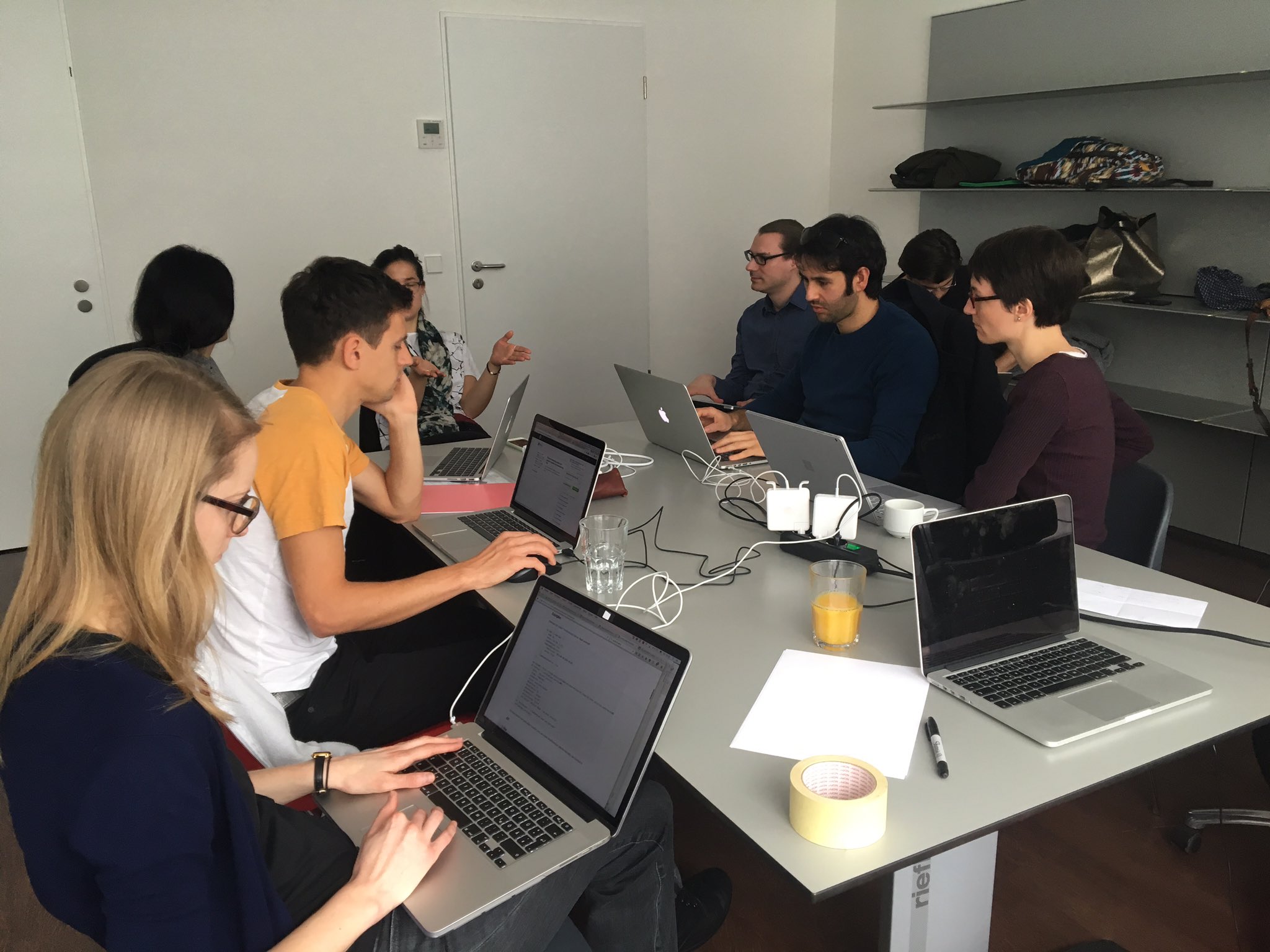
    The hackathon Coding Dürer took place exactly three weeks ago. Now it is time to take a look back. What are lessons learned? What is the way ahead?

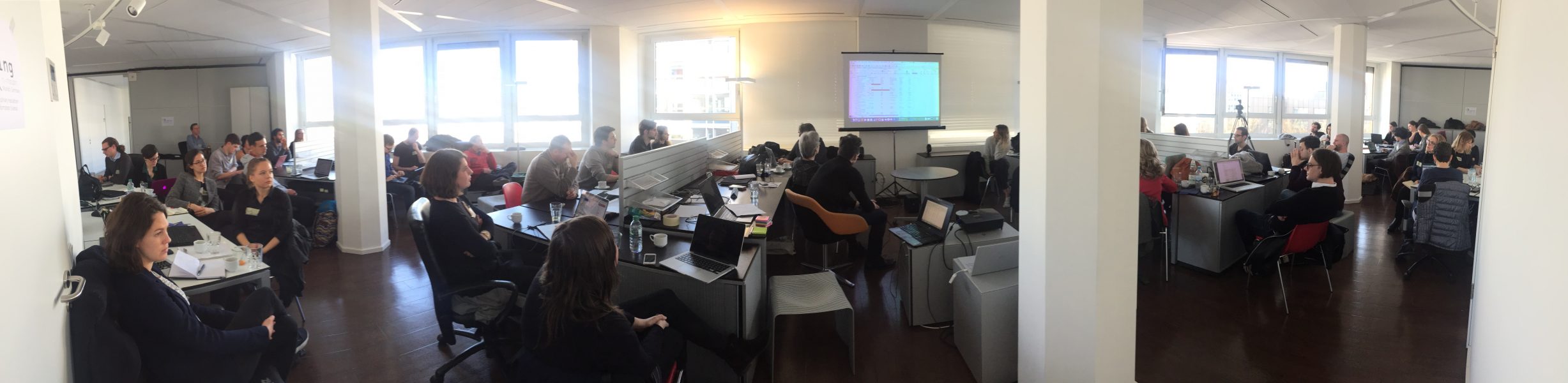
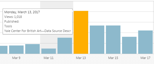
    In addition to the lively working atmosphere of the international participants, the active involvement of many people via social media and live streams had been extraordinarily successful. On Monday alone we had over 1,000 views on our website. Since its launch in November the analytics rose to over 14,000 views.

    Two blogs reported on us. And the hashtag #Coding Dürer worked fantastically to spread what we did over the five days and to get responses from people, who could not be there with us. Alex Kruse has analyzed the hashtags wonderfully and published his R-code on GitHub for everyone to use.

    Alison Langmead from the department of History of Art and Architecture at the University of Pittsburgh gathered colleagues and students in front of a big screen to watch the live streams and twitter as if they were in Munich. That was the kind of involvement I dreamed of.

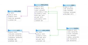
    The final presentation has shown beautifully what we accomplished in only a few days. Until today, the live video has been watched by almost 250 viewers from all over the world—not bad for such a specialized topic. We have seen the results of seven teams: The Rogues, Similarities, Metadata, Chatbot, VABit, Dutch Church Interior Paintings and Tracing Picasso. I have put together a few information about every project on the press page—additionally some teams have documented their work in dedicated project websites or in blog posts, others are still working on that. This is a great help to follow the development of the projects, their challenges and results, and thus giving others the chance to get in contact with them and continue the work.

    Now is a good time to reminisce what the conditions have been for such a productive and creative outcome. Along the way, everyone has learned so much. What I have learned is that the selection and formation of the groups is crucial for interdisciplinary collaboration. Having talked to many, it seems to me that the following points are important:

    1. The size of the group. An interdisciplinary group of art-historians and information scientist is in need of many skills. Therefore it should not be too small. On the other hand, the bigger it is the more communication overhead is necessary. A team on 6-7 participants seems to be ideal.
    2. The balance of skills. The technical realization starting with data cleaning already needs a lot of man power. But having too few art-historians, the group would lack the continuous contextualization of the work in regard to the research question. Balancing the group is, thus, key. In addition: To have a few people experienced in both fields or a designer who can bridge both spheres would be ideal.
    3. An internal project management. While we have had frequent plenum discussions to have every project know about every other, this is also necessary within the group in order to keep everyone up-to-date about the current challenges and goals and assign a role to every participant. Also: The use of visualizations such as flip-charts or simply papers taped to the wall help very much the interdisciplinary communication.

    The Post-It wall seems to have served that need quite well, maybe in an unexpected way, but could be streamlined next time in order to achieve the goals above even better.

    What were lessons learned? According to the participants, who filled out a feedback form, everyone was excited about the course of the week, the thrilling discussions on art from different viewpoints and the astonishing results. One project group proposed that it would be better next time to contact data providers beforehand—as they downed the Getty servers several times! For this reason, it would be productive to have technical support at hand, such as server space. People from different backgrounds had different needs and expectations, but they agreed in one thing: More time to work until late at night—and more coffee and snacks throughout the days!

    To me, Coding Dürer has given a glimpse of what Digital Art History could be in the future. It has shown that the technology is there, we just need to bring the right people together. I have the feeling we have prepared the soil for many projects to keep growing. And I have the strong believe that it has not been the last Coding Dürer. With the things we have learned, we have to plan for a Coding Dürer 2018 already. I welcome every funding organization or sponsor to get in contact with me to pave the way into the future of Digital Art History.

    Thank you @lalisca for everything!

    What are your thoughts?


  • On Methods to Analyse and Visualize Data (A general framework)

    On Methods to Analyse and Visualize Data (A general framework)

    With the aim to respond the kind invitation made by Harald Klinke to be the first speaker of the hackathon Coding Dürer, I thought that my best input could be to draw a general overview of the core concepts and main issues that we need to bear in mind when dealing with data analysis and visualizations.  Then, my purpose was to provide a framework for the tasks that we would have to face during the week.   Irremediably, my situated perspective as art historian underpins the approach to data analysis and visualizations that is displayed through the presentation.

    However, it was only the very beginnings of an intense and fruitful week. I am very grateful to all the participants for allowing me to learn so much, and especially to the Picasso’s group, with which I shared most of the time.

    It is clear that hybrid spaces of collaboration, where multiple knowledge fields and backgrounds converge, represent an invaluable scenario to model new ways of approaching art-historical problems (traditional and new ones) and to shed light over the researching possibilities brought about by the the digital paradigm.

    https://es.slideshare.net/nuriar72/on-methods-to-analyze-and-visualize-data

  • Tracing Picasso

    Tracing Picasso

    Tracing Picasso is a project that aims to analyse and understand the Picasso Phenomenon

    Picasso’s artworks are present throughout the greatest art collections and museums today. We want to retrace the path of these artworks (provenance) as well as their institutional reception, both in Europe and the US, in order to get a better understanding of this global phenomenon. Here are a few of our research questions:

    • When were Picasso’s works acquired by the various institutions?
    • Are there peaks or patterns that can be identified?
    • Which works sparked interested at which times?
    • Through which routes did they spread from their place of creation until their current collection?

    The data set from American museums is very rich and we have therefore decided to produce several types of visualisations to explore it. Data from European museums (specially in Spain and France) is not as easily accesible, and reusable. The amount of labor required to retrieve the data (from European museums), together with copyright issues, had a major impact in the results we are presenting today.

    The time-map

    This interactive visualisation aims to show the migrations of Picasso’s artworks throughout the world. The spatial dimension highlights not only his personal travels (where the artworks are created) but also the one of his artworks (where they were and currently are). The chronological dimension allows for each work to travel from one location to the next. It also shows the growing size of the various collections as the artworks are acquired by the institutions.

    Geo-spatial data viz made using Leaflet.js and own code for timeline and playback functionality

    Demo (tested with Chrome): https://ilokhov.github.io/picasso

    Code: https://github.com/ilokhov/picasso

    Basic features and functionalities for the map/time visualisation:

    • displaying the location of the objects
    • temporal dimension: showing location at a certain time
    • visualise the movement of the objects

    The graphs

    These visual representations of our data set enable more detailed information on the acquisition trends. The graphs reveal certain clusters and peaks that require further analysis, prompting reflexion and creating need to supplement our data.

    MET Museum Data Viz using app.rawgraphs.io

    A few preliminary results:

    • A general observation in the data: there are many more gifts than purchases in the direct provenance of the works.
    • These donations contain certain periods of Picasso’s production that interestingly complete the museum’s collection.

    MoMA Data Viz using app.rawgraphs.io
    Graph comparing aquisition patterns of MoMA vs. Metropolitan Museum. created with app.rawgraphs.io

    The data

    We have currently normalised and merged data from UK and US open access collections:

    To use data, we required several attributes, such as the creation date, the acquisition date and the current collection. We would like and have begun to complete the provenance (all locations and dates for each individual artwork).

    Data processing and clean up

    • OpenRefine (http://openrefine.org/)
    • Excel
    • Access to the cleaned up data will be provided on github
    • Data Structure and interchange format for further use in visualisation: JSON

    Data structure

    Our project might be extended, so that bigger dataset could be used. In that case we put the extended data on a server in a relational DBMS (here open source MariaDB). Then by means of SQL, all queries like “what artworks were produced after two particular artist met”, or “where were centers of art dealers activity after WW2” can be answered. The query result, which is originaly in a table format is transformed then to JSON structure in PHP  and passed to the visualizsation tool. Here there is the relational schema we propose:

    MariaDB relational schema

    Tools for visualisation we evaluated:

    We concldued there is no “out of the box” solution for time/map viz that we found.

    • problems we had with some libraries and tools:
    • not versatile and generic enough
    • too complicated or not well documented enough for easy reuse
    • do not offer sufficient functionalities and have to be extended

    In our case, it was easier to implement the functionality by oneself.

    Implementation geotemporal visualisation:

    Issues encountered:

    • Data
      • Copyright and licensing issues
      • Most data creators, aggregators and projects don’t share data
      • Most databases don’t offer complete data dumps
      • Not all online data is available at the open data repositories
        • eg Tate shows all works online, but the open dataset on github does not include loans -> mismatch
        • eg Met shows provenance on their website, but didn’t include the information in the open dataset
      • Republishing of merged dataset is problematic, as not all data sources share the same license
      • Most open data is not documented properly – call for paradata
      • Most datasets contain complex fields, which summarize lots of information
        • call for reconciliation
      • Location of owner ≠ location of artwork, so we simplified it.
    • Tools
      • SPARQL endpoints:
        • SPARQL offers lots of flexibility, but requires extensive knowledge of the underlying data model
        • Many different data models exist, so queries can’t be reused
          • Wikidata – Wikibase model
          • Europeana – EDM
          • British Museum – CIDOC-CRM
        • endpoints are not stable
      • OpenRefine extensions:
        • Manual installations necessary
        • No standard reconciliation services are pre-configured
      • JS libraries
        • Many libraries out there – difficult to check which one could be used to implement the desired result (takes some time to evaluate them)
      • Data structure
        • Coming up with a good data structure is tricky
      • Data import
        • Problems fitting data from spreadsheets into required JSON format

    Participants

  • Project Groups (4) – Meta Data Group

    Project Groups (4) – Meta Data Group

    The topic of visualization is quite popular at Coding Dürer. We already saw an approach in visualizing interactions of photographers with an artwork as well as an attempt to show how the work of an artist moves around the world throughout time. The “meta data group” engages in a project that relates to the person who gave the Hackathon its name: Albrecht Dürer. The group wants to show to whom and how the artist was related. By creating a graphic plot they want to answer the question of the artist’s relationship to his contemporaries in a way that is intuitive and easy to understand. The main challenge the team faces is to find data that fits their research question. ULAN, thUnion List of Artist Names from the Getty Research Institute, might offer a solution, as its data is organized in a network of categories like “assistant” or “teacher” which the team uses in recreating a network.

    Screenshot of ULAN data (a standardized list of artist’s names)
    The data that ULAN provides (as well as data from online research) can be visualized with the help of WebVowl and Gephi.
  • A moment to report

    A moment to report

    It is quiet today. A few voices and keyboard tapping. Today is working time.

    Since it is also quieter for me, let me report, what we have done so far.

    On Monday, we had a lively discussion on the subject of data, data analysis and data visualization in the context of art history. Many aspects came up from the truth of data, the necessity of cleaning and the viewpoint of the end-user. The question was raised how art-historian and information scientists can work together even if there is this perceived gap. That gap consists of different approaches, ways of thinking and even concepts associated with particular terms. It was agreed, however, that we have to be the agents of change we want to see. This group is such a diverse group of people from different backgrounds that the fruitfulness of interdisciplinary collaboration—that is the flip side of the coin—can probably nowhere better be yielded than here.

    There were also solutions proposed how to fill that gap:

    1. It needs time to work together.
    2. It needs communication, including visual communication (flipcharts are available).
    3. It needs translators, who can bring the fields together.
    4. It needs a shared vision. If everyone knows the goal it is easier to do the first step.
    5. It needs an interdisciplinary mind-set of openness and cognitive flexibility.

    Are there more elements that you think are important? What are your experiences? Let me know in the comments below or via Twitter @HxxxKxxx.

    Then we were talking about data sources and on Tuesday gathered a list of tools. And after a Post-It wall of ideas we formed 8 project teams that started working together. Here is the list of preliminary group names:

    1. Church interiors
    2. Group One (later renamed Picasso Group)
    3. The Americans
    4. The Associatives
    5. Metadata Group
    6. Image Similarity Group
    7. Generative Machine Learning Group
    8. Chatbot for Exhibitions

    Additional input came from contextualising Lunch Talks by Nuria Rodríguez Ortega and Anna Benkowska-Kafel and the very inspiring Evening Talk with Lev Manovich. Also the Lightning Talks, where everyone had the chance to present their home project, showed what a fantastic group comes together here.

    All participants are now in high activity, discussing and gesturing in front of displays. That is wonderful to watch… Today we are looking forward to listening to the Lunch Talk by Justin Underhill (Berkeley University) and tomorrow by Mario Klingemann (Google Fellow). On Friday we will be presenting the results in a public event in the Department for Art History.

    You can follow those parts of the event via live streaming. Past lectures are also archived. You can also follow us on the Twitter hashtag #CodingDurer which is populated with many tweets not only from participants. Here you can contribute and get into a conversation, bring forward your own projects and ideas. We also try to keep you up-to-date on our blog. Have a look at it from time to time.

    We would like to have the global network be part of the event and interweave their talents into our group.

    You can also see an overview of Day 1 and Day 2 on Twitter.

    That’s it for the moment from me.


  • Project Groups (3) – Tracing Picasso

    Project Groups (3) – Tracing Picasso

    Photo by @airun72

    Throughout his life Picasso created a huge body of work, including paintings, drawings as well as sculptures, that travelled around the world. It seems impossible to grasp how and where the objects moved. One project group at Coding Dürer tries to solve this problem and help us understand the provenience of Picasso’s work by using digital tools. They use OpenRefine to handle the metadata provided by the Met Museum and the MoMA. D3 offers great timeline librarys to visualize time and place. Combined with information about Picasso’s life and exhibitions their interactive tool can show us how Pablo and his work moved throughout time.

  • Project Groups (2) – Albot

    Project Groups (2) – Albot

    Photo from Wikimedia

    You’re at a museum and want to find out more about an artwork you like? Then just ask Albot, the art history chatbot. He will access the museum’s metadata for you and answer simple questions about the artwork, like: Who’s the artist? What’s the title? Which people are depicted? At least that’s the vision of one of the project groups at Coding Dürer. They start with Albrecht Dürer’s “Allerheiligenbild” and try to formulate questions. By extracting keywords, Albot can understand questions and find answers. The team still tries to figure out which chatbot to use. Dexter or the Microsoft bot framework seem to offer great solutions.

  • Project Groups (1) – Visualizing Vietnam War Memorial

    Project Groups (1) – Visualizing Vietnam War Memorial

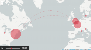
    Victoria Szabo, Justin Underhill and Benjamin Zweig want to visualize the interactions at the Vietnam War Memorial in Washington. As the memorial is not “monumental”, there are no stereotypic, but rather a great variety of photos. Using different tools, they intend to visualize in which ways people experience the object. By looking at photos of the War Memorial they want to find out where people take photos and what kind of photos they take. For that, they use images from flickr as well as the flickr API. Microsoft Cognitive Services can be used for further analysis of the images.